A potential customer lands on your homepage with a question that is much simpler than most business owners expect: Is this the right business for me?
They are not looking for your mission statement first. They are not studying every menu item. They want to know what you do, who you help, where you work if location matters, and what to do next.
If your homepage makes them work to find those answers, many will leave and try the next result. That is not because your business is not good. It is because the website did not make your value easy to understand quickly.
Use this 10-second homepage test to spot the problem and make focused improvements without turning your site into a complete rewrite.
How to run the 10-second homepage test
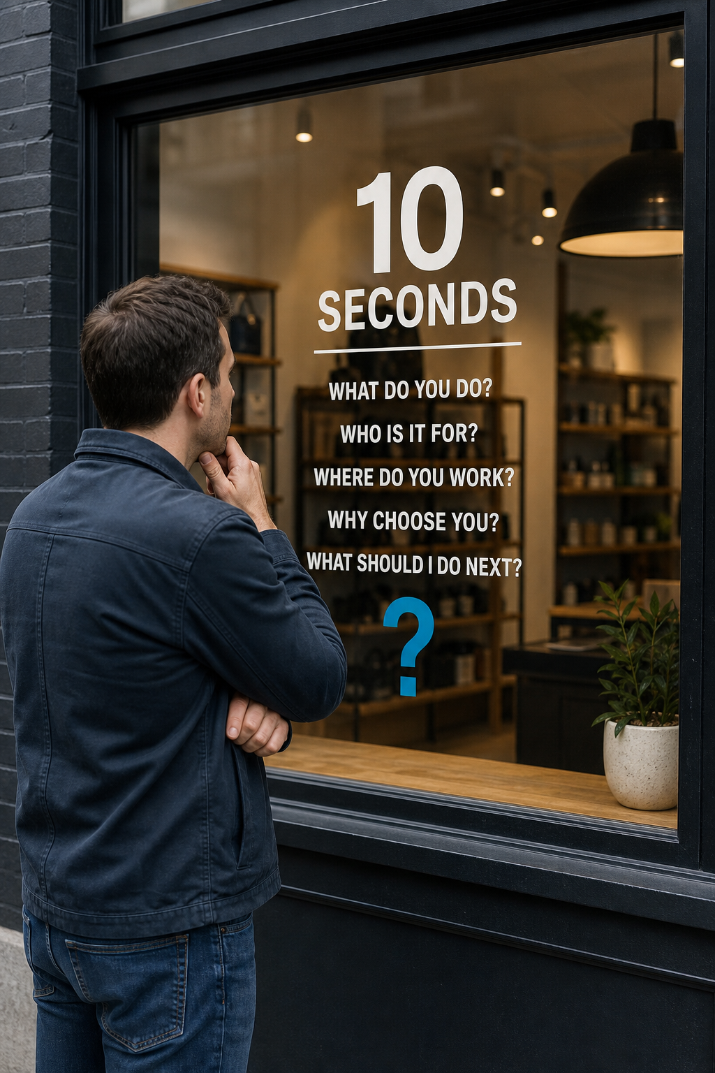
Open your homepage in a private or incognito browser window, preferably on your phone. Look at only the top section before scrolling for 10 seconds. Then answer these questions without hunting around:
- What does this business do?
- Who is it for?
- What area does it serve, if relevant?
- Why might someone choose it over another option?
- What is the clearest next step?
If you cannot answer at least four of these confidently, a first-time visitor probably cannot either. For a more useful check, ask someone who does not know your business to do the same exercise. Do not explain the page before they look at it. Their confusion is useful information.
The five answers your homepage should make obvious
1. What you do
Lead with the actual service, product, or outcome. “Quality you can trust” may sound pleasant, but it does not tell a visitor whether you install HVAC systems, provide tax planning, or sell custom cakes.
A stronger headline is specific:
- Weak: Building Better Spaces
- Clearer: Kitchen and Bathroom Remodeling for Homeowners in [City]
Your headline does not need to be clever. It needs to remove uncertainty.
2. Who you help
Not every business needs to name an audience in the headline, but it should be clear somewhere near the top. This helps visitors recognize themselves and helps filter out inquiries that are not a fit.
For example, an accounting firm may serve “small businesses and independent professionals.” A commercial electrician may focus on “property managers, general contractors, and facilities teams.”
3. Where you work
For local and service-area businesses, geography is part of the offer. A visitor should not have to open the contact page to learn whether you serve their neighborhood or city.
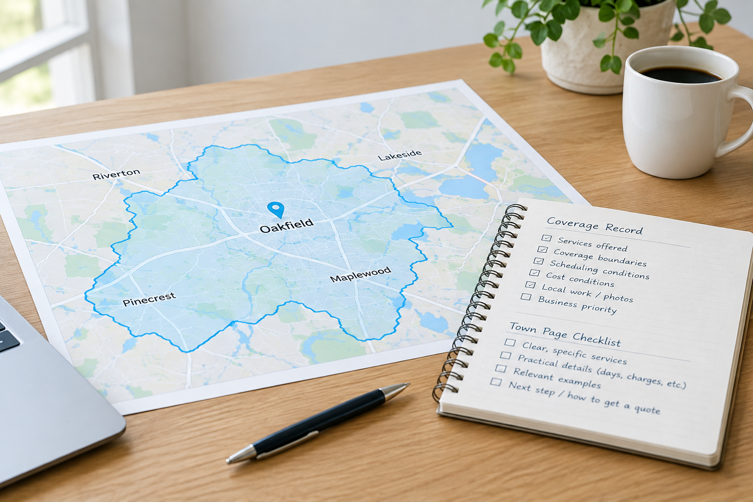
Add your primary city, region, or service area naturally in the headline, supporting text, or a prominent service-area note. Be accurate. Listing every nearby town in the hero section usually makes the page harder to read.
4. Why customers should believe you
“Best service” is a claim. Proof is more persuasive. Near the top of the page, add one or two concrete reasons a buyer can trust you.
- Years in business, when meaningful and accurate
- Relevant licensing, certifications, or insurance
- A clear specialization
- A short customer testimonial
- Review rating or review count, when kept current and presented accurately
- A practical promise, such as transparent estimates or a defined response process
Choose proof that matters to your buyer. A homeowner facing an urgent repair may care about availability and licensing. A business buyer may care more about experience with similar projects and a reliable process.
5. What to do next
Your primary call to action should match the decision a visitor is ready to make. “Learn More” is acceptable for navigation, but it is usually too vague to be the main action for a service business.
Try a direct, low-pressure option such as:
- Request an Estimate
- Schedule a Consultation
- Call for Service
- Check Availability
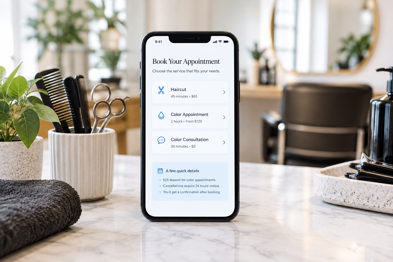
- Book an Appointment
Use one primary action in the opening section. You can offer a secondary option, such as a phone number, for people who prefer it. Giving equal visual weight to four different actions creates hesitation instead of momentum.
A practical homepage formula
A strong opening section often follows this simple structure:
Headline: The service or outcome, for the right audience, in the right location.
Supporting text: A short explanation of what makes your approach useful, credible, or easier.
Primary action: The most logical next step.
Trust cue: One compact proof point, such as a credential, review reference, or specialization.
Here is an example for a fictional plumbing company:
Headline: Reliable Plumbing Repair and Water Heater Service in Cedar Grove
Supporting text: Clear communication, licensed technicians, and straightforward options for homeowners who need help without the runaround.
Primary action: Request Service
Trust cue: Locally owned and licensed
This is not fancy copy. That is the point. A visitor can quickly decide whether to continue.
What belongs below the first screen
Once the top of the homepage answers the immediate questions, the rest of the page should support the decision. A useful order is:
- A brief introduction to your key services or product categories
- Links to dedicated service pages with more detail
- How your process works
- Customer reviews, project examples, or other proof
- Service areas or industries served
- A final invitation to contact, request a quote, or book
Think of the homepage as a helpful guide, not a storage closet for every fact about the business. Detailed service information, FAQs, team bios, and project galleries can live on their own pages.
Common fixes that do not require a full redesign
- Replace a vague headline: Say what you actually sell or solve.
- Move the call to action upward: Do not make visitors scroll to find a way to contact you.
- Add a real service area: Especially if you serve customers in person or travel to them.
- Make your phone number visible on mobile: A prominent click-to-call option can remove friction for ready buyers.
- Promote proof: Bring a credential, testimonial, or relevant experience point out of a hidden page.
- Reduce competing messages: If a banner, popup, slider, and video all compete with the main message, remove or simplify them.
When the issue is bigger than the hero section
Sometimes a revised headline and better button are enough to improve clarity. Other times, the 10-second test reveals a deeper issue: the business has no clear positioning, services are organized confusingly, the site looks dated, or the page does not reflect the quality of the company today.
That is still a useful discovery. It helps you distinguish a copy adjustment from a website strategy or redesign project. Start with clarity first. A beautiful website that leaves visitors guessing is still making sales harder than it needs to be.
Your next step
Run the test this week, write down every answer a visitor could not find quickly, and fix the most important one first. For most small businesses, that is a clearer statement of what they do and a direct next step.
If you would like an outside perspective, request a website review. A fresh set of eyes can identify where your homepage is creating uncertainty and what to prioritize next.