A customer clicks “Book Now,” chooses a service, picks a time, and submits their details. Appointment sorted, right?
Not necessarily. Sometimes that button sends a request to an inbox, and someone still needs to approve the appointment. Sometimes the calendar only shows a consultation, not the service the customer thought they booked.
That gap between what the website promises and what actually happens can create confused customers and extra admin. A working button is not the same as a working booking process.
Let’s take apart an illustrative salon booking journey and rebuild it around one question: Does the customer know exactly what they have, and have not, booked?
The example: one button, three different expectations
This is a fictional example, not a review of a real business or a report of measured results.
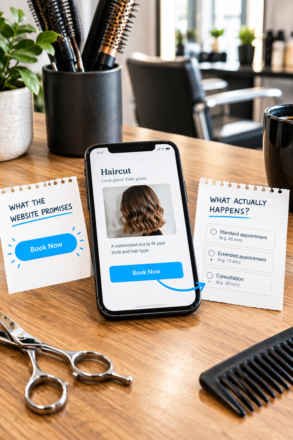
Imagine a salon offering routine haircuts, color appointments, and corrective color consultations. Its website has a prominent “Book Now” button on every service page.
The button opens an external scheduler with these options:
- Standard appointment
- Extended appointment
- Consultation
After selecting a time, customers enter their details and see “Thanks! We’ll be in touch.” Staff must then review every submission before confirming it.
Nothing here is technically broken. But the customer has to guess which appointment fits, whether the time is reserved, and whether they should wait for another message.
First, decide what your business can actually confirm online
Before changing the page, sort your services into booking rules. The right choice depends on how predictable the appointment is, not how modern a calendar widget looks.
Instant booking
Use this when the customer can select the correct service and your system can reliably reserve the required staff, time, and resources. A routine haircut might fit this model.
The button can say “Book a haircut.” The final screen should clearly state that the appointment is confirmed, with the service, date, time, location, and any preparation instructions.
Appointment request
Use this when staff must check suitability or availability before accepting the appointment. Label the action “Request an appointment,” not “Book Now.”
Explain before submission that the preferred time is not confirmed. Give a response window your team can consistently meet and repeat that information on the confirmation screen.
Consultation first
Use this when you need a conversation before determining the service, duration, or price. Corrective color may belong here.
“Book a color consultation” tells customers what they are getting. State whether it is in person or remote, whether there is a fee, and that the treatment itself is scheduled separately.
You do not need to force every service through the same booking model. A mixed approach can be clearer than a single calendar that quietly requires staff to sort everything out afterward.
Teardown point 1: the service page loses its context
In our example, a customer reads about a haircut, then lands on a scheduler asking them to choose between “standard” and “extended.” The website knows what they wanted, but makes them start over.
Where your booking platform supports it, link directly to the relevant appointment type or preselect the service. If it does not, put the exact scheduler label beside the button: “On the next screen, choose Haircut, 45 minutes.”
Better still, replace internal labels with names customers recognize. Keep those names consistent across the service page, calendar, confirmation, and reminder.
If duration depends on information the customer cannot reasonably assess, explain how to choose or route them to a consultation. Do not ask a first-time visitor to do your scheduling team's job.
Teardown point 2: important terms arrive after the commitment
Suppose the salon requires a deposit, but customers only discover that after entering their contact details. Even a reasonable policy can feel like a surprise when it arrives late.
Place a short booking summary near the action:
- What: The service or consultation being scheduled.
- Time: Expected appointment length and any required early arrival.
- Cost: The price, or a clear explanation of how it is determined.
- Payment: Whether a deposit, prepayment, or card is required and how it is applied.
- Changes: Key cancellation and rescheduling terms, with full details available before commitment.
You do not need a wall of policy text beside every button. You do need enough information for customers to decide whether to proceed without an unpleasant surprise.
Teardown point 3: the final screen does not settle anything
“We’ll be in touch” is friendly, but it does not explain the status of an appointment.
For a request-only workflow, clearer example copy would be:
“Your appointment request has been received. Your preferred time is not yet confirmed. Our team will contact you within one business day to confirm availability or suggest another time.”
That response window is an example, not a recommendation for every business. Publish only a commitment you can support, including around holidays and closures.
For an instant booking, use a different message:
“Your haircut appointment is confirmed for [date] at [time] at [location]. We have sent the appointment details to [email].”
Only say an email has been sent when the system actually triggers it. Include a practical way to get help if the message does not arrive. For remote appointments or customers booking across regions, display the time zone too.
Teardown point 4: a full calendar becomes a dead end
An empty availability screen does not tell customers whether you are fully booked, have not opened the next month's calendar, or require new clients to call.
Explain the situation and offer one sensible alternative. That might be a waitlist, later dates, or a phone number for scheduling help.
Be explicit about the alternative: joining a waitlist does not reserve an appointment. Avoid implying that calling will uncover hidden availability unless that is genuinely how your business operates.
Test the promises, not just the clicks
Run a controlled test using your real customer-facing journey. Coordinate with staff so test appointments do not occupy sellable time, and use the platform's test mode for payments where available.
- Start on one specific service page, not the scheduler homepage.
- Check whether the button describes an instant booking, request, or consultation accurately.
- Follow the handoff to the calendar and confirm that service names still match.
- Check the cost and policy information before submitting.
- Compare the final screen, customer email, and staff calendar. They should agree on the service, time, and confirmation status.
- Test the rescheduling or cancellation route, then remove the test booking.
Ask someone unfamiliar with the process, “What do you think happens now?” If their answer differs from your team's next step, you have found a wording or workflow problem worth fixing.
The repair brief for our example salon
The first fix is not a redesign. It is a small, specific booking brief:
- Separate routine bookings from requests and consultations.
- Rename appointment types using customer-facing service names.
- Connect each service page to the appropriate booking option where supported.
- Show key payment and cancellation terms before commitment.
- Replace the generic thank-you message with an accurate status and next step.
- Add a useful explanation when no appointments are available.
After publishing, track wrong-service bookings, questions about confirmation, and requests requiring staff correction. Compare similar periods and note changes in demand or staffing. These observations can show whether the process is becoming clearer, even when booking volume is too small for a meaningful conversion-rate comparison.
Want a second pair of eyes on your booking journey? Get Website Feedback from SolcoMedia. Share the service page and booking route customers use, along with what your team needs to happen after submission.