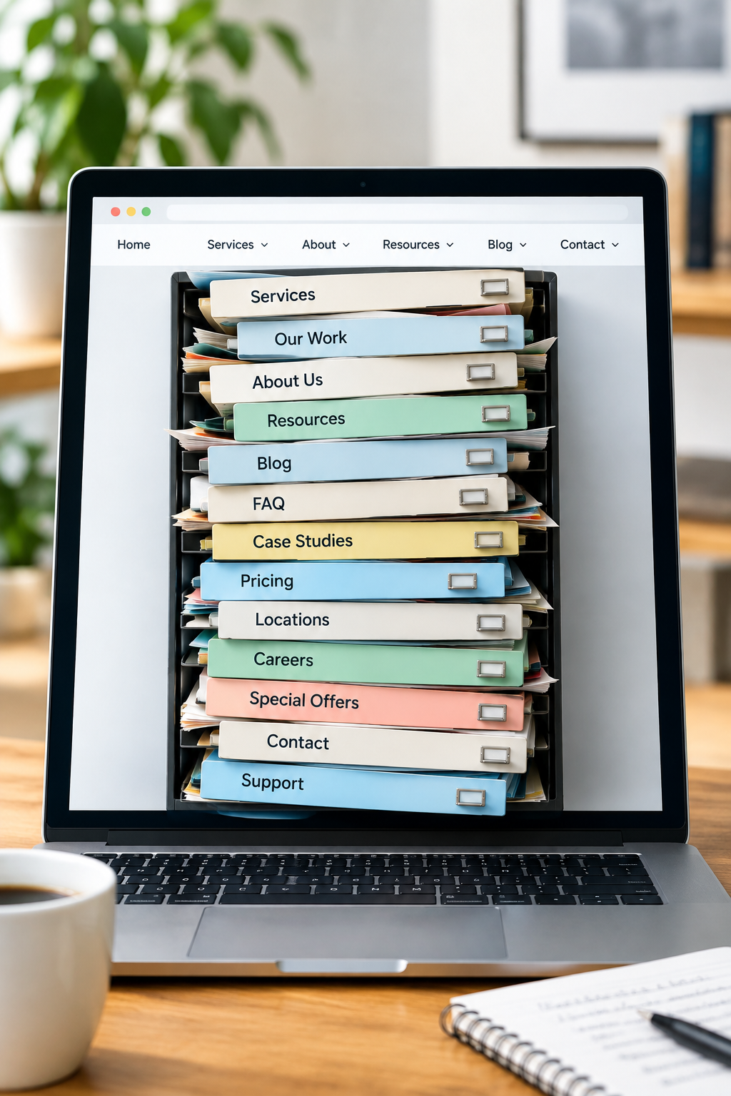
Your website started with five pages. Then you added a new service, a second audience, a resource library, and that special offer someone insisted needed its own menu link.
Every addition made sense at the time. Together, they have turned the menu into a filing cabinet with the drawers left open.
Customers do not know how your business organizes its work. They arrive with a task: find a service, check whether you serve them, compare options, or get help. Your navigation needs to support those tasks, not preserve the history of everything you have published.
Before paying for a redesign, check whether clearer labels and a better page structure would solve the problem. Here is how to make that decision without rearranging your entire website on a hunch.
Start with the questions customers are trying to answer
Do not start by debating whether your menu should say “Solutions” or “Services.” First, collect the things people actually need to find.
Use recent inquiries, sales conversations, and support requests. Write down five common tasks in customer language. For a commercial cleaning company, those might be:
- Find out whether you clean medical offices.
- Check which locations you serve.
- Understand what happens during a site assessment.
- Request a quote for recurring cleaning.
- Contact someone about an existing contract.
These are illustrative tasks, not a recommended menu. They give you a way to judge the menu you already have.
If customers regularly call to ask where something is on your website, include that task. A helpful receptionist may be quietly compensating for a confusing site.
Make a page inventory before moving anything
A spreadsheet is enough. Record each important page's current URL, menu label, purpose, intended audience, and next step. Include pages linked only from the footer or from old campaigns.
Then give each page one of four jobs:
- Main destination: A page that supports a frequent or commercially important customer task.
- Supporting detail: Useful information people need after choosing a destination.
- Utility: Policies, account access, support information, and other practical links.
- Review candidate: Outdated, overlapping, or unclear content that needs an owner to decide its future.
This stops every department, service, and PDF from competing for a place in the main menu.
Check available traffic and inquiry data before removing a page. A page can be absent from the menu and still attract useful visitors through search or a direct link. Low traffic alone is not a reason to delete an important support or policy page.
Choose labels a first-time customer would understand
“Our World,” “Discover,” and “What We Deliver” can sound inviting in a branding meeting. In a menu, they often make visitors guess.
Try labels that describe what is behind the link. Depending on the business, that could mean “Cleaning Services,” “Who We Help,” “Service Area,” “Pricing,” or “Contact.”
A useful menu label lets someone predict the destination before clicking.
Watch for overlapping labels. If you have “Services,” “Solutions,” and “Capabilities,” could a new customer explain which one contains the answer they need? If not, the distinction probably belongs inside the content, not across three menu items.
Organize by service or by audience?
Use service labels when customers generally know what they need. A bookkeeping firm might lead with bookkeeping, payroll, and cleanup work.
Audience labels can help when different customers need genuinely different information. A supplier serving homeowners and trade contractors might need distinct purchasing instructions for each.
You can offer both routes, but avoid building two competing copies of the same website. An audience page can explain relevant needs and link to the appropriate service pages. It does not need to repeat them word for word.
Build a menu that introduces the site, not one that contains it
There is no magic number of menu items that makes every website usable. The useful question is whether each top-level choice has a clear, distinct purpose.
For our hypothetical cleaning company, an initial structure might be:
- Services: An overview with links to individual cleaning services.
- Who We Help: Relevant information for offices, medical facilities, and other supported customers.
- Service Area: Where the team operates and any coverage limits.
- About: The business, its team, and relevant credentials.
- Request a Quote: The main route for prospective customers.
Existing-customer support could sit in a clearly visible secondary position. Policies and less frequently needed reference information could live in the footer.
This is a starting hypothesis, not a template to copy blindly. If existing customers account for a large share of visits, support may deserve more prominence. If pricing is central to choosing your service, do not hide it simply to keep the menu tidy.
Do not make a dropdown do all the work
A service overview page gives visitors somewhere to compare options, especially when they do not recognize your terminology. A dropdown full of specialist names cannot always do that job.
Make the overview page easy to reach. If a menu heading also opens a submenu, ask your developer to ensure the link and toggle behavior are clear and usable with touch and keyboard controls.
Connect the pages below the menu
People can enter your website through a service page, an article, or a shared link. They may never see the homepage.
Each important page should help them answer three questions: Where am I? Is this relevant to me? Where should I go next?
A service page might link to coverage information, a relevant project example, and the quote process. An article explaining a customer problem might link to the service that addresses it. A support page should lead to support, not force existing customers through a new-sales form.
Use descriptive link text such as “See our commercial cleaning services” instead of repeated “Learn more” links with unclear destinations.
These connections reduce dependence on the main menu. They also help you avoid stuffing every useful page into it.
Test the proposed structure before building it
You can test a draft menu as a simple clickable outline or prototype. Recruit a few people who resemble your customers and do not already know your website.
Give each person a realistic task without using the exact menu label. For example: “You manage a dental practice and want to see whether this company handles businesses like yours. Where would you go?”
- Record their first choice.
- Ask what they expect to find there.
- Note hesitation, backtracking, and wrong destinations.
- Ask what label they would have looked for if they got stuck.
Do not explain the menu while they test it. If you have to say, “Oh, that is under Solutions,” you have found something worth fixing.
A small test is directional feedback, not proof of a conversion improvement. Look for repeated confusion, revise the relevant labels or grouping, and test again. Then check the implemented version on phones and with keyboard navigation.
Separate a navigation change from a URL change
Changing a menu label or moving a link usually does not require changing the destination URL. Keeping those decisions separate can make the work smaller and safer.
If you merge, remove, or rename page URLs, ask your provider for a redirect and internal-link plan. Do not delete useful pages simply because they no longer belong in the main navigation.
After launch, check the header, footer, page links, and mobile menu. Confirm that important tasks still lead to the right destination and that quote, booking, or contact paths remain functional.
Give your provider a focused brief
Instead of asking for “a cleaner menu,” send a brief that includes:
- The five customer tasks the navigation must support.
- The current pages and proposed groups.
- Labels that testers misunderstood.
- Pages that need a clear next-step link.
- Which URLs should stay unchanged.
- Acceptance checks for desktop, mobile, and keyboard use.
Ask for a navigation-only scope first, plus any content or technical dependencies. If your site platform makes those changes difficult, have the provider explain why before expanding the project into a rebuild.
The goal is not fewer links at any cost. It is fewer moments when a customer has to stop and work out what you meant.
Want a second set of eyes? Get Website Feedback from SolcoMedia. Share your website and the three things customers most often struggle to find so the conversation starts with real tasks, not personal design preferences.