Your booking button looks great. But can someone reach it using a keyboard? When a form rejects an email address, does it explain the problem, or just turn a tiny border red?
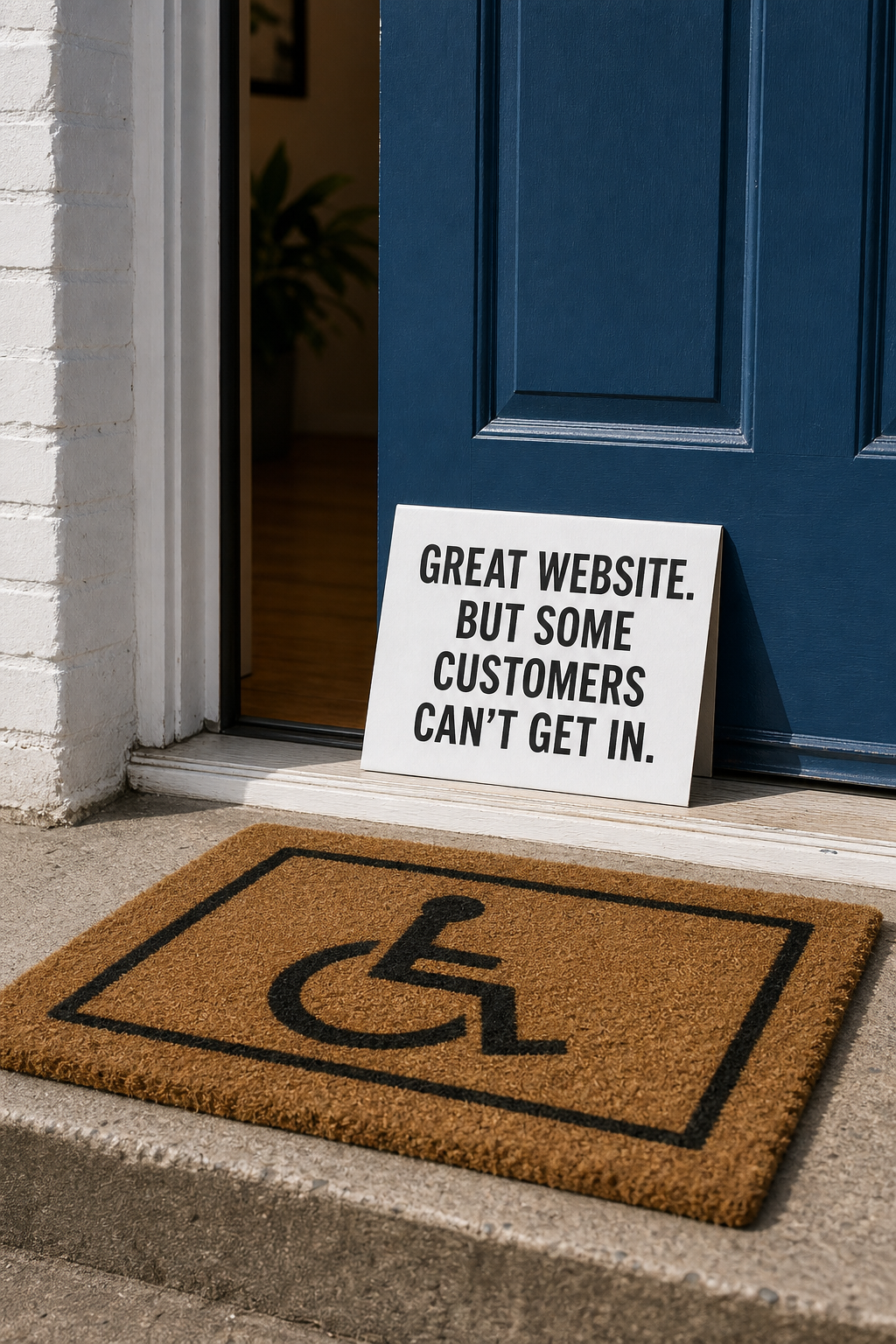
These details decide whether some customers can do business with you at all. People may navigate with keyboards, screen readers, magnification, voice controls, or a combination of tools. A website that only works for someone who can see every detail and click precisely leaves people out.
You do not need to become an accessibility specialist to spot some important barriers. Start by checking one real customer task, then give whoever maintains your website a clear repair brief.
Choose one task that matters to your business
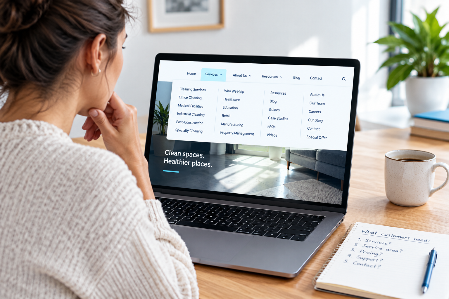
Pick a journey such as finding a service and requesting a quote, booking an appointment, or checking a product and reaching checkout. Start on the page a customer would actually enter, not automatically the homepage.
Include anything that appears along the way: cookie notices, menus, chat widgets, forms, and third-party booking tools. Customers experience these as one journey, even when several vendors supply the pieces.
Set aside about half an hour for an initial check. This is a way to find obvious problems, not a complete accessibility audit or a legal compliance test.
Put the mouse aside and follow the journey
Open your website in a desktop browser. Use Tab to move forward through interactive elements and Shift+Tab to move backward. Enter usually activates links and buttons; Space commonly activates buttons and checkboxes. Some controls, such as radio groups, use arrow keys.
If Tab does not reach links, check your browser or operating system keyboard-navigation settings before assuming the website is broken.
Can you see where you are?
The currently selected link, button, or field should have a visible focus indicator, often an outline. Follow it from the page entrance to your main action.
- Is the indicator clearly visible against the background?
- Does it move through the page in an order that makes sense?
- Can you reach the navigation, main content, and primary action?
- Does a sticky header or floating widget cover the selected element?
If you repeatedly ask, “Where did it go?”, record the location. Removing a focus outline for a cleaner design can leave keyboard users navigating blind.
Can you open things and get back out?
Try the mobile-style menu if it appears, any expandable questions, and any popup that interrupts the journey. You should be able to operate controls without hovering a mouse over them.
A modal popup should move keyboard focus into its content, keep navigation within the open dialog, and provide a keyboard-operable way to close it. When it closes, focus should return somewhere sensible, usually the control that opened it. Escape is a common expected way to dismiss dialogs.
Stop and flag a blocker if you cannot continue or close an obstruction without using the mouse. A booking button is not useful if a promotional popup makes it unreachable.
Give the form a deliberately bad submission
Let your team know you are testing, and use dummy information rather than customer data. On a live checkout or booking system, agree on a safe test method first so you do not create charges or reserve real appointments.
Leave a required field empty or enter an invalid email address. Then check what happens.
- Labels: Does each field have a persistent name, such as “Email address,” rather than instructions that disappear when you type?
- Requirements: Are required fields and formatting instructions explained before submission?
- Errors: Does the page say what went wrong and how to fix it, rather than relying on color alone?
- Recovery: Can you reach the problem field using the keyboard, and does the form preserve other valid entries?
- Confirmation: After a successful test, is the outcome clear?
A visible label is a good start, but it also needs to be connected to its field in the underlying code. Error and success messages need to be available to assistive technology. Ask your developer to verify those connections rather than judging them by appearance.
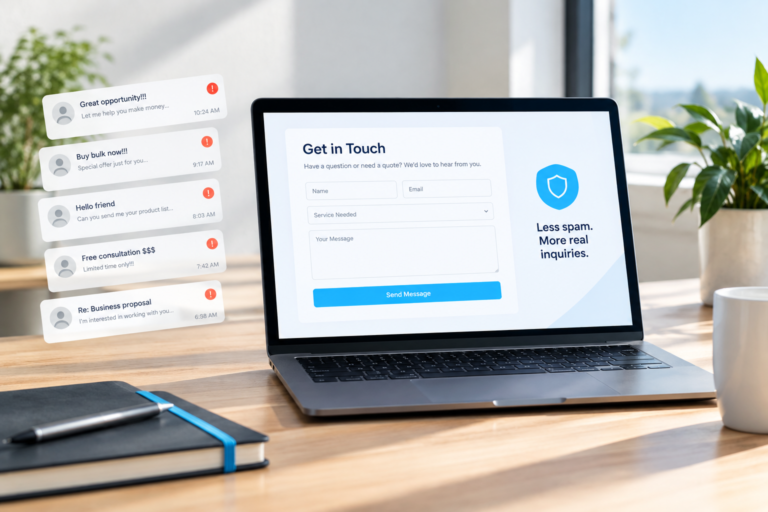
If a CAPTCHA blocks completion, ask about an accessible alternative and review the whole spam-protection setup. Do not simply remove protection without considering the consequences.
Enlarge the page and check readability
Use browser zoom to enlarge the page to 200 percent. Look for clipped headings, overlapping text, vanished controls, and forms that become difficult to use. This catches some problems, but it does not replace testing at higher magnification and narrow viewport widths.
Then examine instructions and links. “Required fields are red” is not enough for someone who cannot distinguish that color. “View boiler repair options” is more useful out of context than several identical “Learn more” links.
For contrast, use a checker rather than trusting your monitor. WCAG Level AA generally calls for a contrast ratio of at least 4.5:1 for normal text and 3:1 for large text. There are separate requirements for interface components and other visual information, so a passing paragraph does not mean the whole page passes.
Keep essential information as actual text instead of embedding it in a promotional image. Meaningful images need appropriate text alternatives; purely decorative images generally should be ignored by screen readers. An image description should communicate its purpose, not provide a home for extra keywords.
Use an automated scan as a helper, not a verdict
Tools such as WAVE or axe can flag issues including some missing labels, contrast failures, and structural problems. Run a scan on the pages in your chosen journey, not just the homepage.
Automated tools cannot determine whether every image description is helpful, whether the reading order makes sense, or whether someone can comfortably finish a booking. A clean scan is not proof of accessibility.
The same caution applies to accessibility widgets. A toolbar offering larger text or different colors does not, by itself, repair inaccessible navigation, form code, or third-party tools. Ask what a proposed solution changes underneath the interface and how those changes will be tested.
Turn findings into a repair brief
Skip vague instructions such as “make the site accessible.” Give your developer or agency something they can reproduce.
For each issue, record:
- The page address, browser, and device used.
- The exact steps that caused the problem.
- What happened and what you expected instead.
- The customer task affected.
- A screenshot or short recording, if useful.
- The person responsible for fixing and retesting it.
For example: “On the appointment page in Chrome, Tab reaches the date picker, but I cannot select a date with the keyboard. This prevents appointment booking. Please repair or replace the control and retest the complete booking journey.”
Fix task-stopping barriers first, followed by serious difficulties and then smaller improvements. Shared components deserve attention early: repairing a broken navigation menu can help across the entire website.
If a third-party scheduler is responsible, send the issue to that vendor and ask for a repair timeline or an accessible replacement. While it is being fixed, provide a clearly explained alternative contact route. That helps customers now, but it does not make the original barrier acceptable to leave indefinitely.
Know when to bring in a specialist
Arrange a fuller assessment when your initial check reveals blockers, a customer reports difficulty, you are preparing a redesign, or you need evidence against a defined accessibility standard. Ask whether the scope includes manual keyboard testing, screen-reader testing, key third-party tools, and retesting after repairs.
Testing with people with disabilities can reveal usability problems that technical checks miss. WCAG 2.2 Level AA is a useful technical reference to discuss, but legal obligations depend on your location and circumstances. This article is not a legal assessment.
Once repairs are complete, repeat the original customer task. Add that check to your routine whenever you change navigation, forms, booking tools, or major page templates.
Your next step: choose one valuable customer journey and try it without a mouse today. If you find a barrier and need help deciding where to start, contact SolcoMedia with the page address and your test notes.