Most small-business owners check their website on a desktop, where everything has room to breathe. Your customers are often doing the opposite: standing in a driveway, sitting in a waiting room, or comparing options between errands. They have one hand, a small screen, and very little patience.
A website can look perfectly respectable on a laptop and still make it frustrating to call, book, or request a quote on a phone. That is not a cosmetic problem. It is a lead problem.
This mobile lead test helps you find the friction between a customer deciding, “I might contact them,” and actually completing the action. You do not need special software. You need a phone, a few minutes, and a willingness to notice the annoying bits.
Start with a real customer task
Do not begin by scrolling around and asking whether the site “looks good.” Give yourself a job a prospective customer would actually have. Choose the task most valuable to your business:
- Call for urgent service
- Request an estimate
- Book an appointment
- Check whether you serve a particular area
- Find pricing or understand the process before getting in touch
Then open your site on a phone using cellular data if possible. Start from Google, your Google Business Profile, a social-media link, or an ad landing page, depending on how customers commonly find you. Those starting points matter because they often send visitors to a page other than your homepage.
Complete the task without using your insider knowledge. If you have to think, “Well, customers should know to open that menu,” write it down. They probably will not.
The 7-point mobile lead test
1. Can they understand the offer before they scroll?
On the first screen, a visitor should be able to tell what you do, who it is for or where you serve, and what action to take next. A giant logo, a vague headline, or a full-screen photo can push all of that below the fold.
Check: Is the primary message readable without zooming? Is the first action clear? Does the page give local visitors a clue that you serve their area?
Fix: Use a direct headline, a short supporting sentence, and one obvious primary action. For example, “Residential electrical repairs in [service area]” is more helpful than “Powering your possibilities.” The latter may sound nice, but it does not help a person with a sparking outlet.
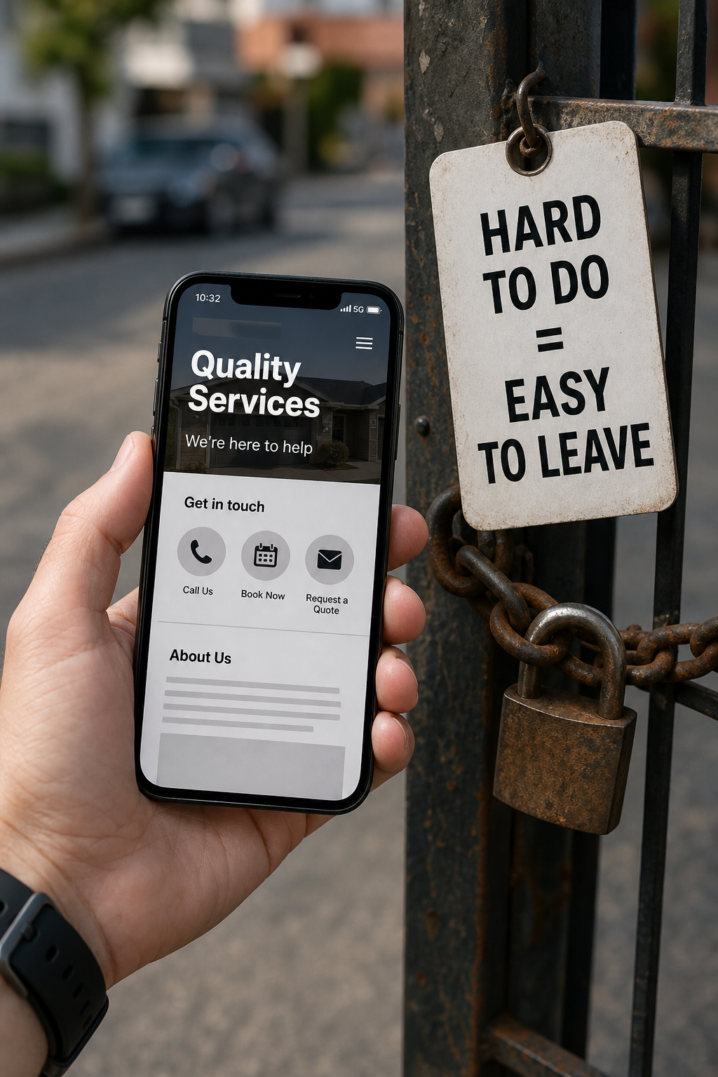
2. Is the fastest contact option always easy to reach?
For many service businesses, the fastest path is a phone call. For appointment-based businesses, it may be booking. Either way, customers should not need to hunt through a menu or reach the footer to act.
Check: Can you spot the phone number or primary action quickly? Does tapping the number open the phone dialer? Is the button large enough to tap without precision?
Fix: Put the primary action near the top of key pages and consider a simple sticky mobile button for “Call,” “Get a Quote,” or “Book.” Keep it focused. A row of four competing buttons creates a tiny decision committee no one asked for.
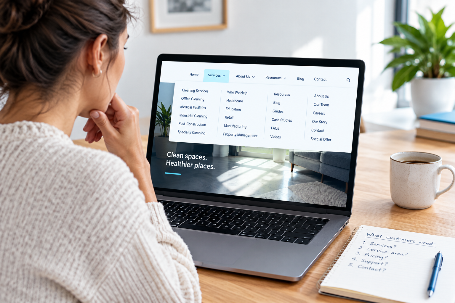
3. Does the mobile menu help people choose a path?
A mobile menu is not a storage unit for every page on the site. Visitors should be able to find services, service areas when relevant, proof, and contact information without decoding a long list of labels.
Check: Does the menu open and close easily? Are labels plain language? Can a visitor reach a core service page in a couple of taps? Does the menu cover the page or trap the user?
Fix: Prioritize the pages customers use to make a decision. Group secondary pages under clear headings if needed. Use “Services,” “Areas We Serve,” “About,” and “Contact” rather than clever labels that require interpretation.
4. Can they read and trust the page without pinching and zooming?
Small type, cramped paragraphs, low-contrast text, and tiny links make a visitor work harder than they should. On a mobile screen, hard-to-read content is easy to abandon.
Check: Can you read the main copy comfortably? Are buttons and links easy to tap? Do testimonials, credentials, and service details remain legible? Does any important content get cut off, overlap, or require horizontal scrolling?
Fix: Break long copy into short sections, use descriptive subheadings, leave space around tap targets, and make contrast strong enough for comfortable reading. Do not hide vital details in a slider that is hard to operate on a phone.
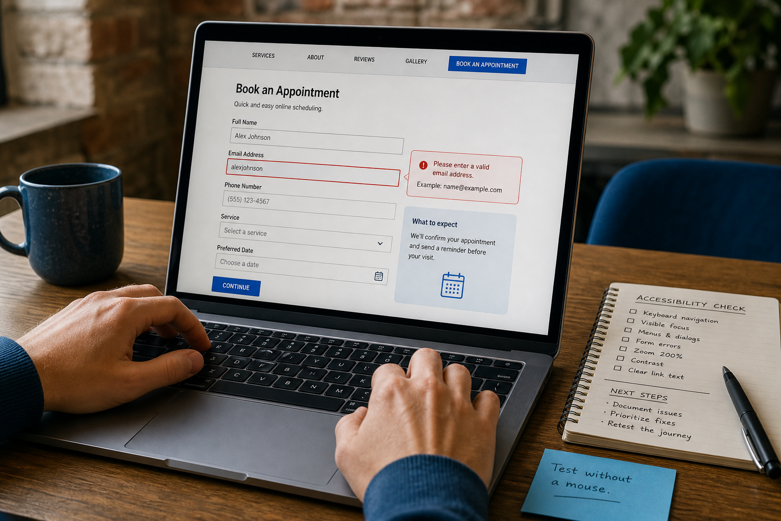
5. Does the form feel proportionate to the request?
A person asking for a quick estimate should not have to complete a job application. Every extra field asks for more effort, more time, and more confidence in your business.
Check: How many fields must someone complete before sending? Does the right keyboard appear for phone numbers and email addresses? Are error messages clear? Can you submit the form with one thumb?
Fix: Ask only for the information needed to start the conversation. Name, contact method, service need, location, and a short message are often enough. If detailed intake is necessary, collect it after the initial inquiry or explain why you need it.
6. Is the page fast enough to keep the task moving?
Mobile visitors are less forgiving of heavy pages, especially on weak connections. A slow page can make every part of the lead path feel broken, even when it technically works.
Check: Do the key pages show useful content promptly? Do large images jump around as they load? Does a booking widget, map, chat tool, or popup delay the page or cover the action button?
Fix: Focus first on the pages where people contact you: homepage, service pages, contact page, and booking or quote page. Compress oversized images, remove unnecessary plugins or scripts, and make sure popups do not block the task. A separate speed review can identify the technical cause if the issue is not obvious.
7. Can they recover when something goes wrong?
Visitors make mistakes. They tap the wrong item, enter a phone number incorrectly, or arrive on a page that does not answer their question. A useful mobile experience gives them a clear way forward.
Check: Does every important page offer a next step? Is contact information available beyond the form? If a booking tool fails or a form has an error, is there an alternate way to reach you?
Fix: Include a clear next action on every high-intent page and offer an alternate contact route, such as a tap-to-call number. Confirm successful form submissions with a useful message that explains what happens next.
Test the pages people actually use
You do not need to test every page in one sitting. Start with the pages that have the greatest impact on leads:
- Your homepage
- Your top two or three service pages
- Your contact, quote, or booking page
- Any page linked from your Google Business Profile or paid ads
- Your most important location page, if you serve multiple areas
For each page, record the task, where you got stuck, and the smallest reasonable fix. A screenshot with a short note is enough. The goal is not a beautiful audit document. The goal is a usable repair list.
How to prioritize what you find
Not every issue deserves the same response. Use this order:
- Fix now: Broken call buttons, forms that do not submit, hidden contact details, unreadable content, blocked menus, or buttons covered by popups.
- Fix next: Unclear page messaging, too many form fields, weak page hierarchy, hard-to-find services, and unclear service-area information.
- Plan: A dated visual style, inconsistent page templates, complicated navigation architecture, or a site platform that makes routine improvements difficult.
Small fixes can make a meaningful difference when they remove a direct obstacle. But if the same issue appears across the whole site, the problem may be the template, content structure, or website strategy rather than one troublesome button.
Run this test monthly and after every major change
Mobile problems have a talent for quietly returning. A new form, popup, plugin update, booking tool, or page edit can change the experience without anyone noticing. Run the mobile lead test after major updates and on a regular schedule. Ask someone outside the business to try it too. Fresh eyes are especially good at finding assumptions baked into the site.
The standard is simple: when a ready customer reaches your website on a phone, contacting you should feel easy. If it feels like work, the website is asking too much at the exact moment it should be helping.
When to get a deeper review
If your site passes a casual visual check but leads are inconsistent, a structured website review can help connect mobile experience issues with messaging, traffic sources, forms, tracking, and lead routing. The best next step is not always a redesign. It is understanding which obstacle is costing you the most opportunities and fixing it in the right order.