You pay for an ad promising a specific service. Someone clicks, lands on your homepage, and has to hunt for that service all over again. That is an expensive way to say, “Please browse around.”
Before increasing your advertising budget, check whether the page receiving those clicks actually continues the conversation your ad started. The fix might be a better destination URL, a clearer service page, or a dedicated landing page. It does not automatically mean rebuilding your website.
This is a practical review you can do with one live ad, its destination page, and the person who handles incoming inquiries.
Start with one ad, not your whole website
Choose an ad that is actively spending money. Copy its exact wording, note who it targets, and open the destination URL on your phone. If possible, use your advertising platform's preview tools rather than clicking your own live ad.
Write down four things the ad leads someone to expect:
- The service: What specific help are they looking for?
- The fit: Which location, customer type, or situation does the ad address?
- The offer: What pricing, availability, consultation, or other promise appears?
- The next step: Are they expecting to call, book, buy, or request an estimate?
Now compare those expectations with the page. Can a visitor confirm each one without opening a menu or interpreting vague copy?
A page can look polished and still fail this check. “Solutions for every season” is not much help to someone who clicked an ad for furnace repair.
Check the promise before changing the design
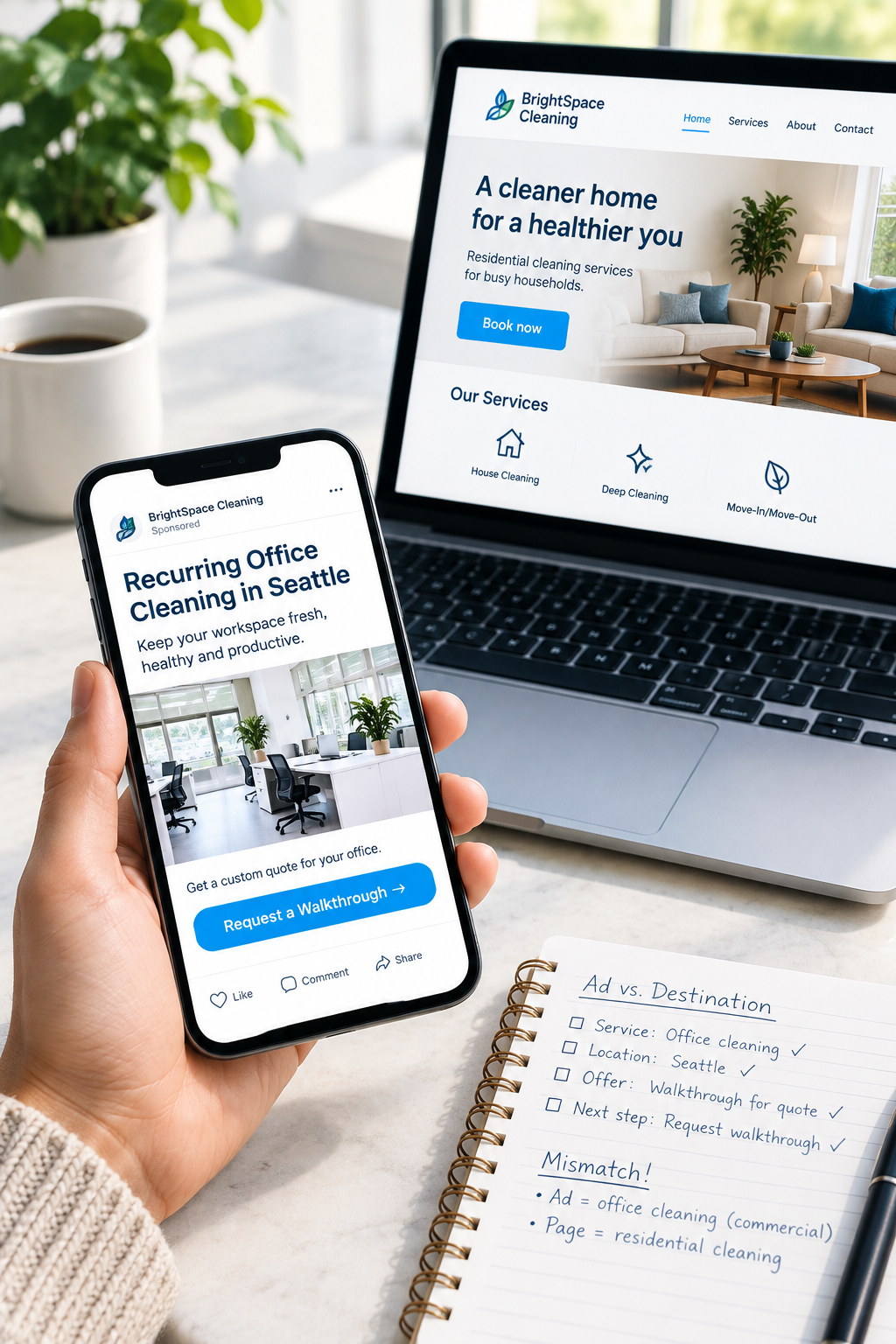
Imagine a hypothetical cleaning company advertising recurring office cleaning in a particular city. Its ad offers a walkthrough to prepare a quote. The click goes to a homepage featuring residential housekeeping and a “Book now” button.
The company may offer both services, but the visitor cannot easily tell whether they are in the right place. The booking button also suggests a different process from the advertised walkthrough.
A better destination would make the connection explicit:
- Headline: “Recurring office cleaning in [actual service city].”
- Scope: A short explanation of the offices served and available cleaning arrangements.
- Process: “Request a walkthrough so we can understand your space and prepare a quote.”
- Action: “Request an office walkthrough.”
These are illustrative examples, not claims about a real business. Your version should reflect what your team actually delivers.
If the offer is inaccurate, fix the ad and the page together. Do not make a page promise same-day service, a free consultation, or a fixed price just to match an ad that should not be making that promise.
Do you need a dedicated landing page?
A landing page is simply the page someone arrives on. A dedicated campaign page is built for a narrower audience or offer. You do not need one for every ad.
Use an existing service page when the intent already matches
If your ad promotes a standard service and you have a strong page explaining that service, start there. Check that the location, offer, proof, and next step are appropriate for the campaign.
Sending visitors directly to that page may solve the problem without adding anything new to maintain.
Create a dedicated page when the campaign needs a different conversation
A separate page can make sense for a specific customer type, seasonal offer, or service package that would feel buried or confusing on your regular page.
For example, a commercial maintenance agreement may need different explanations and a different inquiry process from a one-time residential repair. Those differences are useful reasons to separate the pages.
Keep the homepage when the visitor really needs an overview
A homepage can be appropriate for a broad brand campaign or people searching for your business by name. The question is not whether homepages are bad. It is whether this page answers the expectation created by this ad.
Avoid creating dozens of nearly identical pages just because you have dozens of keywords. Group campaigns by meaningfully different needs, not tiny wording changes.
Give the visitor enough information to take the next step
Your campaign destination should help someone decide, not merely repeat the ad in a larger font. Build around the questions that stand between interest and a useful inquiry.
What exactly am I getting?
Explain the service, who it suits, where it is available, and any important exclusions. If an advertised price applies only to a defined package, show those conditions close to the price. Do not make people submit a form to discover that the offer does not apply to them.
Why should I trust this business for this job?
Use relevant evidence: an authentic review about this service, a real project example, or applicable qualifications. A testimonial about kitchen remodeling is not the strongest support for a commercial roofing campaign.
Keep claims accurate and obtain appropriate permission for customer material. You do not need a wall of badges. You need proof that answers a reasonable concern.
What happens after I click?
Match the button and form to the actual process. “Book an appointment” should not quietly become “Send a request and wait for someone to call.” If staff must confirm availability, say so before submission.
Ask for information needed to evaluate or respond to the inquiry. An office-cleaning walkthrough might need a contact name, business contact details, location, and approximate space size. It probably does not need a lengthy facilities questionnaire at the first step.
Provide realistic response expectations that your team can meet. Avoid collecting sensitive information through a general inquiry form.
Reduce distractions without making the page a dead end
A campaign page should have one clear primary action. That does not mean removing every link or hiding information people need to feel comfortable.
Keep access to relevant business details, privacy information, and useful supporting content. Offer a sensible alternative contact method when appropriate. Someone who needs to clarify a detail should not have to abandon the page to find your phone number.
On a phone, check whether pop-ups, cookie notices, chat widgets, or sticky buttons cover the offer or form. Complete the action yourself. A button that looks excellent in a design file does not earn points if it blocks another button on a real screen.
Measure useful inquiries, not just button clicks
Before judging the page, confirm that a completed form or booking is recorded correctly and reaches your team. A click on “Request a quote” is not the same as a submitted request.
Agree with your advertising provider on what counts as a conversion. Keep low-intent actions, such as opening a form, distinguishable from completed inquiries and qualified leads.
Use a simple campaign record containing:
- Ad campaign and destination page.
- Spend during the review period.
- Genuine inquiries received.
- Qualified inquiries that fit your service, area, and capacity.
- Booked work or sales when the outcome becomes known.
For example, advertising spend divided by qualified inquiries gives you cost per qualified inquiry. If there are no qualified inquiries, report that plainly rather than trying to calculate a meaningful unit cost.
Tracking will not always capture every touchpoint. Consent choices, cross-device visits, and offline conversations can leave gaps. Combine reporting with staff feedback, and keep personal information out of tracking URLs and analytics event details.
Make one focused improvement before increasing spend
If you find a broken form, expired offer, or clearly wrong destination, address it promptly. If you are testing a messaging improvement, record the change and date, then avoid changing the targeting, offer, and page layout all at once. Otherwise, interpreting the result gets messy.
Small campaigns may not generate enough leads for a reliable A/B test quickly. A handful of inquiries is not proof that a new page is a winner. Look for repeated patterns over a period that fits your sales cycle, and note changes in budget, targeting, or seasonal demand.
Your immediate assignment is simple: pick one ad, check its promise against its destination, and identify the biggest mismatch. Fix that before buying more visits to the same confusing experience.
Want another set of eyes on the destination page? Request a Website Review from SolcoMedia. Share the ad wording, the page URL, and the action you want customers to take so the discussion starts with the actual journey, not just how the page looks.